Trubanc
On Monday, I talked about a new idea I had for a Loom-like system with public-key-signed balances. Well, I've been madly writing code since then. I'm calling it Trubanc. There's a design document, and you can peruse the code as I write it. I intend to keep it open source, so that it can be verified. The server is about 1/3 done. When I finish that, and an initial web client, I'll let you know, and you can try it out, with funny money, of course. Exciting!
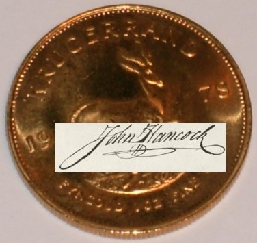
If you know how, and are willing, I'd love the signature on the logo above to be curved and reduced so that it would fit from about 3 to 5 o'clock near the edge of the coin. The images I started with are here and here. I'll give a GoldNowBanc GoldGram to the first person to submit an image that I like (you'll need a Loom account to take it).
Very Nice!
Very nice! Definitely what I had in mind. Thank you.
The signature doesn't stand out enough. Maybe it should be a little bigger, and possibly an opaque background or a different foreground color. Though I prefer letting the gold show through, if it can be obvious that there's a "John Hancock" there. Obscuring or partially obscuring the words "Fine Gold" would be OK. I want it to be recognizable as a signature with the size reduced.
will tweak tomorrow
Yeah, it needs to be bolder. Pretty sure I can fit it in there without obscuring anything and still make it pretty obvious. Just needs more than the 10 minutes I had to noodle with it this morning.
Second attempt
How's http://davespicks.com/images/billstclair-composite2.jpg strike you? The only thing I'm really unhappy with is the angle of the lighting on the letters doesn't quite match. I think I'd need to start over from larger originals to be completely happy there.
It looks like the signature is embossed
It looks like the signature is embossed on the coin. Very nice. But it still doesn't stick out. I want it to be obvious that the point of the logo is the signature. I think an opaque background is the only real way to do that. And covering "Fine Gold", so it can be a little larger relative to the coin's size. Like a sticker, with rounded edges, or maybe even triangular cutouts around the edge, like an award sticker on a book, though that may not work with the concave edge. But I've gotta be approaching the limit of what one GoldGram will buy. Sigh...
making it stick out
I'm having a mental block on how to make it stick out without looking like a cheaply done sticker.
As for "buying" it, I played with it for fun. We'll see if I come up with an idea that I like, but it's probably not going to be today.
Thanks, Dave
Thanks, Dave. I'm mostly joking about the GoldGram. I'll certainly give it to you, and you may be able to convince Patrick to trade it for some Capulin Coffee Units, with which you can purchase a pound of coffee, plus there's a guy online selling cigars for GoldNowBanc GoldGrams, but I don't know anything else to do with it.
Glad you had fun with it. Wish I knew how to do that kind of stuff. I'm strictly a copy and paste, crop and resize kinda guy with images.
Trubanc progress
I've finished coding the server enough to start writing the client. In case you haven't looked recently, public git archive of the code.


Is this what you're looking for?
Something like http://davespicks.com/images/billstclair-composite.jpg ?
If that's the right idea, I can do a lot better job over the weekend.
Edit comment